Breaking Down the Icon
One benefit of working at GA-CCRi is the opportunity to stretch outside of our comfort zone. We consider developers to be innovators and solution engineers who can tackle any problem presented with the skillset we are continually building. This was one of the tasks I was faced with a few months ago in my role as a full stack software engineer, as described by the issue-tracking ticket:
“We need to create icons for each [vessel in our web-based mapping interface] that visually distinguish different vessel types while retaining the ability to show heading [of the vessel].” The request included a list of vessels.
GA-CCRi uses many icons from the Font Awesome toolkit, but for more unique application actions or map symbology requirements we create custom icons for our icon-font library. In this case, we needed a family of vessel icons to represent vessels on a map. I have minimal graphic design experience, but with the guidance of senior designers and fellow solution engineers, I ultimately landed on a family of vessel icons that are now in production. I’d like to review how I went from Point A: Terrified of Drawing Stick Figures to Point B: Confident in Creating SVG (Scalable Vector Graphic) icons. Keep in mind that this is only one way of approaching design! There are many design models that you may find useful in the process.
Establish Requirements
Although it may be tempting to jump into a digital editor such as Figma, the first step to tackling icon design is actually defining the overarching user goal and purpose. Design requires a well-defined problem to come up with a well-defined solution. We must remember that there may always be a better solution than the ones suggested on the ticket where I learned of the request, and only through exploration of the problem can we determine the appropriate solution. We must redefine requirements, explore potential constraints, and understand the purpose of each icon requested. For my vessel ticket, the solution was pretty apparent—create vessel symbology that functions at multiple scales so that users can easily identify, at a categorical level, the “type” of vessel shown on the map.
My first step was to get a better understanding of the vessels I’d be representing. I began researching my list of vessels, pulling real-life images of them from an aerial point of view. I wrote out descriptions of each and began categorizing by shape, purpose, cargo type, and whether they were commercial or military to gain a better understanding of my icon subject.
Going back to the original ticket and customer, I determined that not every vessel listed needed its own icon. Some vessels could be represented by a single, categorial icon on the map. It also became apparent in discussion that certain vessels would need to be accentuated due to importance. This iterative process of researching and redefining is a crucial step in understanding what you are designing. Once you feel like you’ve narrowed down the requirements for your icon, you may begin the process of simplifying from real-life imagery to iconography.
Observe and Simplify
Going from a high-fidelity, real-life object to a simplified icon is not easy. My goal was to create vessel icons that were quick and easy to understand.
We are quick to draw connections to images that exist in our daily lives. For example, the calendar icon shown here is shaped like the calendar that lived in your family’s kitchen. It has the turn-over rings at the top to switch out the months and the grid to show the dates. Notice how it’s not a perfect representation of a month (4 columns for days and 3 rows for weeks), but it gets the job done. When designing your icon, think of objects that already exist in our lives that could act as a visual representation. This is where all of our requirement research comes into play!
When simplifying the vessels, I researched currently symbology for military vessels. I also looked at how Moqups, Font Awesome and Noun Project symbolized ships to grasp an understanding of how to create a family of cohesive vessel symbology. As you can imagine, this wasn’t readily available on the web. For more common tasks, such as selecting a feature, we can search for “select” icons to collect precedent icons. For general tasks, such as “play a video” or “view a calendar”, we can reuse recognizable icons in known icon libraries without creating custom SVG images. To make an easily understood icon, look for key imagery based on your (and your client’s) experiences with technology and the object you are symbolizing. Collect 10-15 (or as many as you need) precedent images on a Google document, spreadsheet, PowerPoint deck, Moqup page, or Figma canvas and then continue to sketching.
Ideation and Iterations
I used the images I collected to begin the freehand sketches of potential icons. I incorporated original thoughts, and aspects of the relevant precedent images, as well as aspects of other icons that fit the ticket. When designing a family of vessels, I created a set of rules that brought each vessel together—for example, a similar structure base and similar spacing rules.
After I felt comfortable with 5-10 iterations of the icon, I presented these sketches to customers and coworkers who were familiar with the ticket requirements and personas. This step is crucial in design. The best-crafted icon might be worthless if it doesn’t trigger an insight from your customer. Feedback will define your final product. Your first iterations may be off track—that’s what makes sharing so important!
After a couple of iterations, your possible icons will be narrowed down into a smaller set. Begin to sketch those icons within a rough outline of the icon template (described below). This will help to visualize how the icon needs to be simplified. Simplifying your icons will be an entire iteration (or multiple iterations!) of its own. Reduce lines that appear redundant, use simple shapes to build your icon, and sketch a smaller version of the icon and see if its intent is still obvious. Using these newly, well-defined and simplified sketches, you’re ready to bring it to the next phase in iteration: the vector-drawing program.
Creating the SVG
You may use a number of different vector-based drawing programs such as Figma, Illustrator, or Inkscape to create an SVG image. I use Figma, so I’ll be using Figma terminology, but all of these actions will be available under different nomenclature in each system.
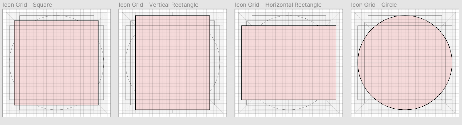
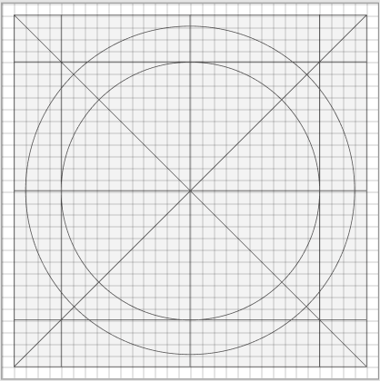
The base of each SVG should be an icon template. The template ensures that each icon is the same size (in our case, 512px by 512px), that each icon is created with the same amount of padding to buffer for scroll bars and browser rendering, and that the icon weight is proportional by size.
The red areas in the illustration above represent visual weight guidelines so that the set of icons maintain roughly the same visual weight. Icons may extend slightly outside of the red area, but should always be contained in the gray area, reserving the white padding around each icon. Each template includes additional proportion guidelines to use as a starting point for construction, as shown on the right. Using the template as a base, there are three primary tools to construct your icons: lines (like the templates), grids, and shapes. You can use one or a combination of any of the tools to draw your icon.
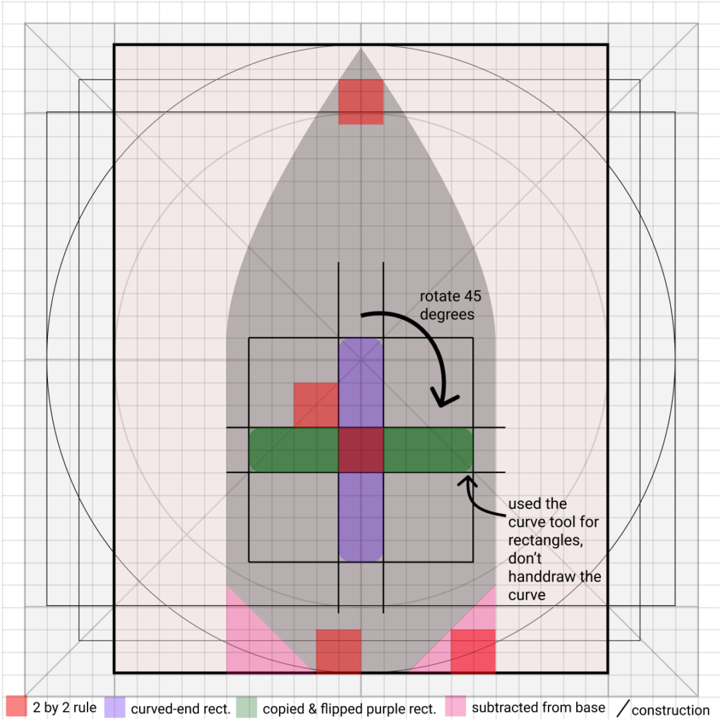
Construction lines and grids are the lines you draw to guide the creation of your vector. With the vector drawing tools in your editor, you can snap to a line, evenly spaced across the horizontal and vertical (for even columns and rows respectively), and reflect shapes over a line. You can create sub-shapes or use predefined shape vectors such as rectangles or circles in your drawing program and combine them to help create portions of your designs using the boolean operations in your editor, as shown in the image below. If your icon design is symmetrical, or has symmetry in parts, lines can help guide you towards drawing half of that symmetrical piece so that you can duplicate and flip it to create a perfect second half.
On the left you’ll see some of the strategies mentioned above to create the Mine & Patrol vessel icon. I used triangles (made with Figma’s freehand pen) and rectangles (made with its rectangle vector tool) to create negative space from the base vessel structure. I used construction lines for alignment and to keep to a consistent 2×2 grid rule shown by the light red squares. Using Figma to apply a radius to rectangles (or a radius to a circle) keeps a uniform shape within the application, which is not a guarantee with the freehand pen vector tool.
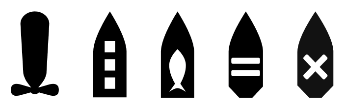
If you look to the finalized icons below, you can see that the Mine & Patrol vessel on the right is similar but different from the Cruiser/Destroyer/Frigate vessel icon on the left. They use the same base shape and the rectangles are uniformly curved, but they ultimately have different shapes within the base. Differences between the vessels create unique identities to help identity the vessel type. Below you can clearly see that each vessel is different, with the overall shapes and themes identifying unique vessels.
Once you’ve created all of the pieces, use the editor tools to combine your vectors. You can union two vectors to create a cohesive shape. You can subtract a vector from a shape like the cross or triangles to create negative, transparent space in an SVG. Once your icon is entirely merged into one path using boolean operations in your drawing tool, you are ready to export as an SVG and add your custom icons to an icon font library.
Updating the Icon Font
At GA-CCRi, we use an icon font repository to share our icons across all projects. The repository holds all SVG files for the icons, which are transformed into a font using the npm package webfonts-generator. The icons can be used with either a CSS class or Unicode specified by a configuration. There are many other ways to use custom icons in your project, including spritesheets and rendering of native SVGs in your web application. Font services such as IcoMoon can be useful to preview your exported SVG images or to create a hosted set of SVGs or icon fonts for your web application.
Designing Your Own Icons
Creating an icon, like all elements of design, takes observation, practice, and iteration but is a skill that can be developed. I am still honing my “design eye” and have found icons to be a true deep dive into the principles of design. Training my eye by reading icon tutorials and examining icon systems such as Font Awesome is particularly useful in capturing some dos and don’ts of iconography, but as with coding, practice is what is most important in improving your designing skills. Formal design training usually entails 4-6 hour studio classes, 3-5 times a week for 2-4 years. That’s a lot of time practicing! My progress has been expedited by working with an excellent group of designers here at GA-CCRi. Their feedback and encouragement is what keeps my design muscles developing. Although it takes practice, these steps should help you on your way to becoming an icon professional. I can’t wait to see what you design!