Composing Big Data Maps With GeoMesa and Geoserver
When building web based data visualization applications, you usually want to defer rendering and styling to as late as possible in the request lifecycle. This gives your users the most flexibility when composing and customizing intelligent visualizations of data. For instance, if your API responds only with data as application/json or application/xml, then charts and graphs can be rendered in the browser by the excellent d3.js library. Users can choose chart styles (bar vs. line), colors, and other properties of a dataviz without incurring the cost of server requests for each action.
The same rule applies to building map visualizations of data. You gain the most flexibility by starting with a base map and adding vector layers on top. The vector layers can be rendered, styled, and sized in the browser. However, sometimes you simply have too much data and a browser quickly becomes overwhelmed trying to render thousands of vectors on the fly. Interactivity is adversely affected because each zoom or pan by a user results in a re-render operation of all the vectors. The natural solution is to render the map as a WMS layer and display tiled pngs or jpgs in the browser. The problem with that approach is that you have to anticipate all the types of queries your users will make and build attribute based SLD styles for each of those queries. These SLDs are static and challenging to compose.
I had to address this problem recently when I was digging through the GDELT data set[1] using GeoMesa and Geoserver. GDELT is the Global Database of Events, Language, and Tone put out by a collaboration of researchers at Georgetown University, UPenn, and UT Dallas. It consists of around 230 million geocoded events gleaned from text processing of news articles. Dynamically filtering and visualizing this data set is not exactly trivial. We have been using GeoMesa to perform ad-hoc analyses against the entire dataset. By specifying CQL queries like ‘EventCode LIKE “20%”‘, I can visualize all “Unconventional Mass Violence” events on an interactive map. I can compare “Unconventional Mass Violence” to conventional “Fight” events using the CQL filter “EventCode LIKE “19%” or EventCode LIKE “20%”‘. However, the different event types are not distinguished by independent icons on the map. I could build an attribute based SLD to visualize this subset of the data, but that doesn’t allow much flexibility in filtering based on attributes other than ‘EventCode’. Fortunately, I discovered a neat trick in Geoserver’s WMS request support that allows me to dynamically compose and style a map visualization from the client side but have it rendered on the server.
Basically, you can specify multiple layers, styles, and filters in a WMS request and Geoserver will align each of those parameters when rendering your map. So, I created a set of simple SLDs such as ‘redcircle’ and ‘greensquarerotated’ which I used to dynamically compose a map rendered server-side. The request contained the same layer multiple times, a different CQL filter for each instance of the layer, and a corresponding style. Layers and styles must be separated by a comma while CQL filters must be separated by a semi-colon. Let’s take a look at the decomposed URL request.
http://geomesa-dev:8080/geoserver/wms? // The base WMS URL
TIME=2012-12-01T00:00:00.0Z/2013-03-31T23:59:59.999Z& // The temporal query bounds
LAYERS=gdelt,gdelt& // The gdelt layer, specified twice and separated by a ‘,’
STYLES=redcircle,redfillgreenstroke& // Two styles, one for each gdelt layer separated by a ‘,’
CQL_FILTER=EventCode LIKE ‘19%’; EventCode LIKE ‘20%’& // Two CQL filters, one for each gdelt layer separated by a ‘;’
FORMAT=image/png& // Standard query and formatting options
TILED=true&
TRANSPARENT=TRUE&
TILESORIGIN=-180,-90&
SERVICE=WMS&
VERSION=1.1.1&
REQUEST=GetMap&
SRS=EPSG:900913&
BBOX=3756852.81,4226571.91,3913395.84,4383114.94&
WIDTH=256&HEIGHT=256
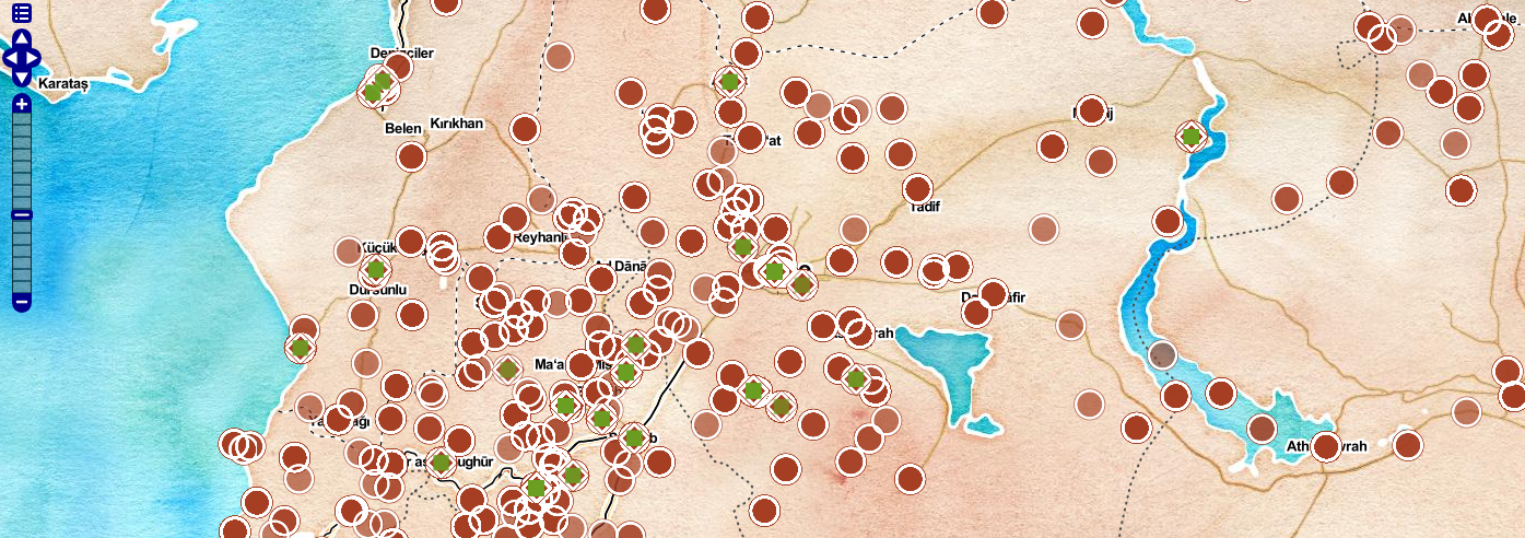
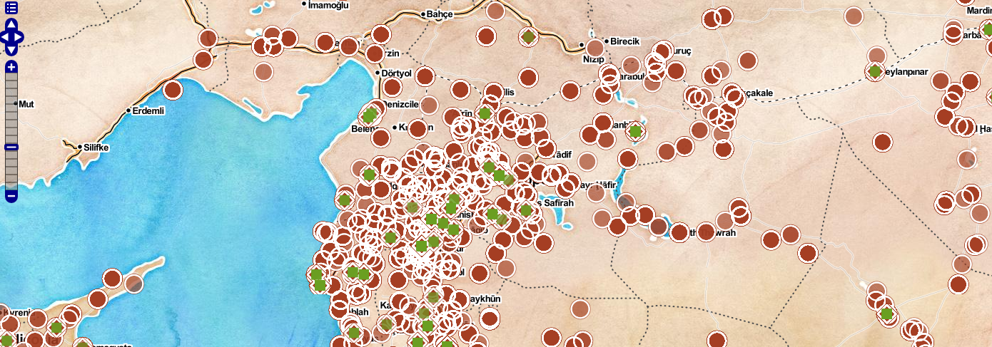
The results are shown in the accompanying images. The visualization maps conventional and unconventional warfare events in Syria in 2012. “Unconventional Mass Violence” events are represented as green squares inside of rotated red squares while conventional “Fight” events are represented as red circle. The base map is a combination of the ‘watercolor’, ‘toner labels’, and ‘toner lines’ tiles designed by Stamen[2]. The icons are simple point feature SLDs created in geoserver using overlays of the available simple shapes like ‘circle’ and ‘square’ and css fill and stroke parameters. The result is a map dynamically composed by the client but rendered on the server against large data sets. Of course, the URL would not be constructed by hand – rather, an API such as OpenLayers would build the URL and manage the requests against Geoserver.