COVID-19 and Air Traffic
With COVID-19 now spread across the globe and the entire world hunkering down for the long fight, people have started to wonder what the future will look like. With a vaccine projected not to come until next year at the earliest, many have speculated that we’ll be playing whack-a-mole with coronavirus, with new local outbreaks springing up and requiring containment. Every outbreak then threatens neighboring communities, which is especially challenging given how the definition of “neighbor” looks very different in our global society, where coronavirus can catch flights all over the world.
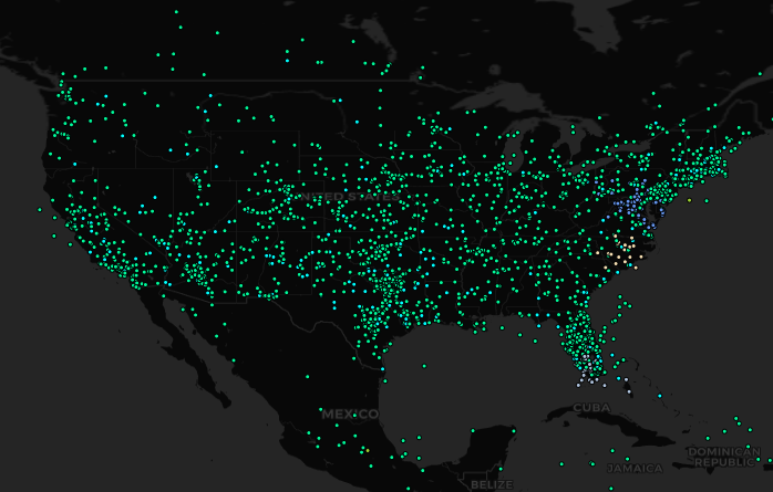
These discussions made us at GA-CCRi curious about how coronavirus spread from its origin point in Wuhan. Here at GA-CCRi, we have access to a wealth of positional data for airplanes around the world. If you tracked the flights out of Wuhan, and then tracked where flights from those destination airports went, could you map out how COVID-19 might have spread around the globe? If you could develop a technique to do so, you might be able to get ahead of future pandemics and better inform communities about the risk of spread in the future.
The Data
This project relied mainly on ADS-B data (short for Automatic Dependent Surveillance – Broadcast). ADS-B consists of positional data broadcast by airplanes with associated metadata such as destination and origin. Planes broadcast this data for air traffic control purposes, but since it’s broadcasted, commercial receivers can collect and aggregate it. Companies have these receivers spread around the globe collecting this data, creating a global picture of air traffic for interested parties. The ADS-B data we used was collected by the Technical Systems Management Corporation and stored in GA-CCRi’s Optix platform for exploration, analysis and insights.
On our first investigations of the data, one thing that stood out clearly was COVID’s impact on the number of flights worldwide. Compare these two time-lapse animations of the same three-hour period over England, one from January 8th, and the other from April 23rd:
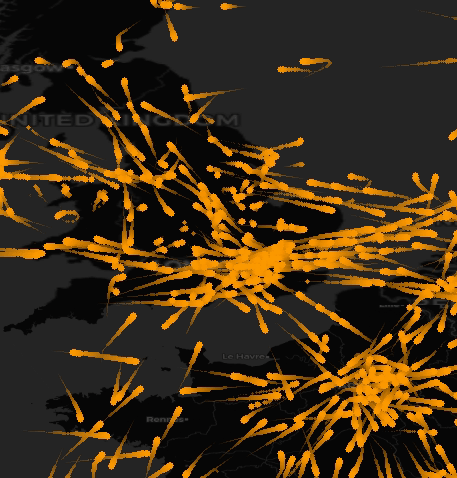
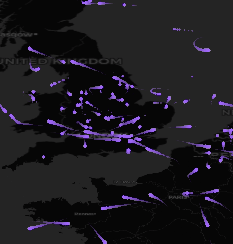
While it isn’t a surprising finding, visualizing the effect of the virus on air travel helps to better appreciate the impact. The skies are much emptier these days.
Another source of data we integrated is the extraordinary COVID-19 dataset that Johns Hopkins University has developed. We looked specifically at their country-level data, which contains daily case totals starting on January 22nd.
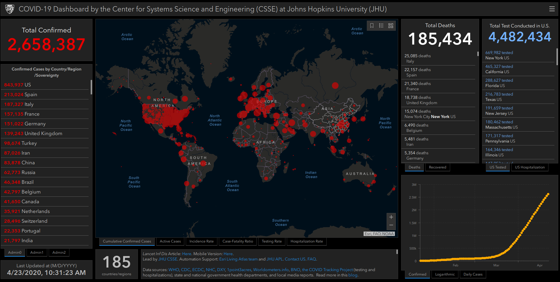
This gives us a metric that we can use to track what countries COVID-19 spread to and when. One of GA-CCRi’s areas of expertise is fusing disparate data sources together to provide a common picture of the world; by combining flight and disease data, we can build a single view of the impact of air travel on the global spread of coronavirus.
Wuhan to the World
In order to measure how connected different countries are to Wuhan, we started by collecting data about every single airplane that flew out of the Wuhan International Airport between January 1st and January 8th of 2020, before any restrictions on travel were in place. (The virus was present in Wuhan at the time, but the pandemic was still in its early stages.) We can then map out every airport that had a direct link out of Wuhan:
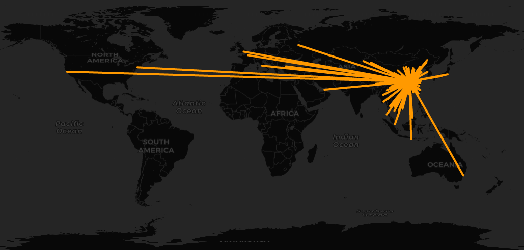
We then repeated the process for each of those airports and created a directed graph that connects each one:
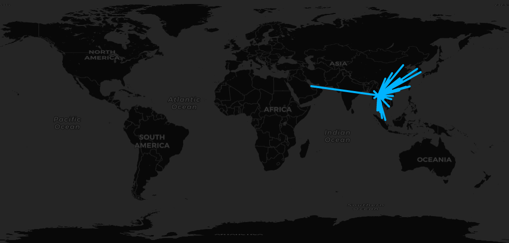

Flights out of JFK, which had a few flights from Wuhan
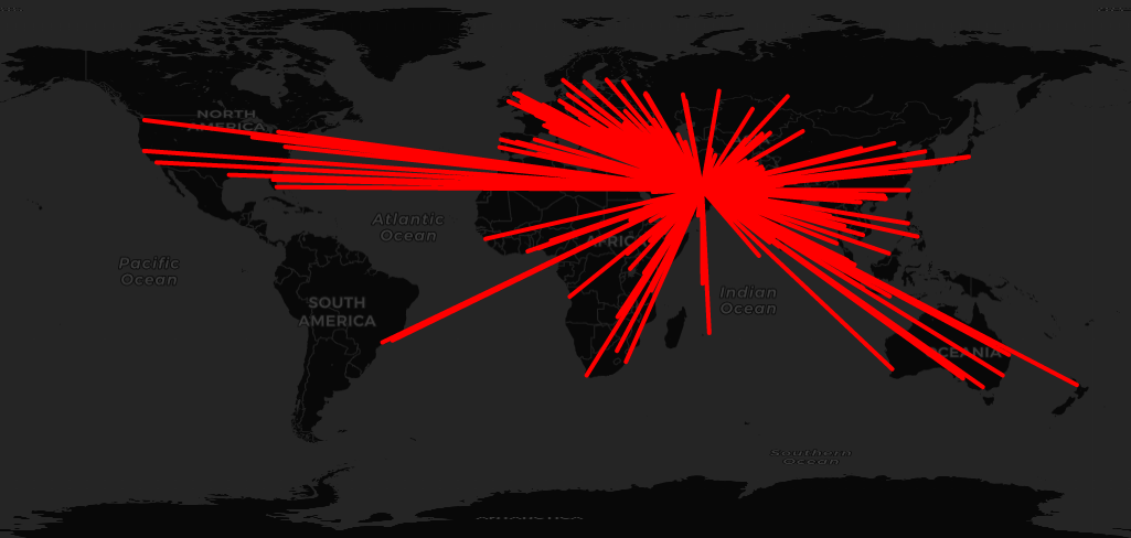
Repeating this process an additional time gave us a network that starts in Wuhan and ties it to anywhere a passenger could reach in three flights, which covers 69 different countries. Since we also have the number of flights that flew along those routes, we can aggregate this data together by country, creating a metric that defines how many connections a country had to Wuhan within one hop, two hops, and three hops. We named these first, second, and third order connections, respectively.
Modeling the Spread
Armed with historical air data and the temporal JHU disease metrics, we wanted to know how predictive the air data was of where the virus had spread. To measure this, we used the Johns Hopkins data to calculate how many days into 2020 the virus appeared in a country—for example, the virus first appeared in Thailand on January 13th, which was 13 days into 2020. While testing availability varied from country to country, this should still be a fairly reliable measure of when coronavirus was present in each country.
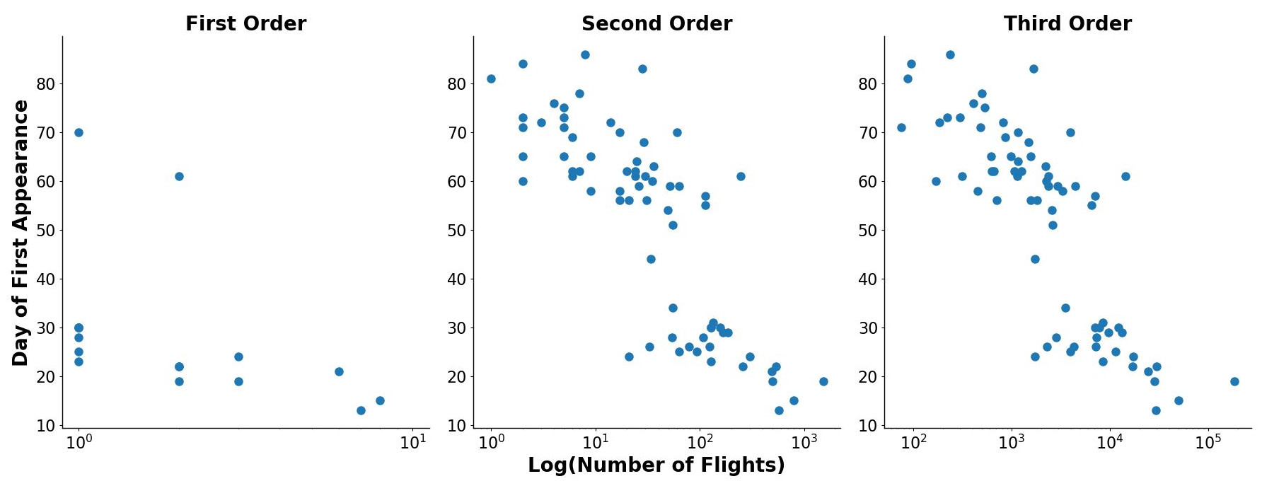
This metric played well with linear regression. Here’s what the two sets of data we collected look like, graphed against each other, with the day of first appearance along the Y axis and the total number of flights along the X axis (for instance, in the first order plot, the three countries that had 2 first order connections to Wuhan saw the virus appear 20, 26 and 64 days into 2020):
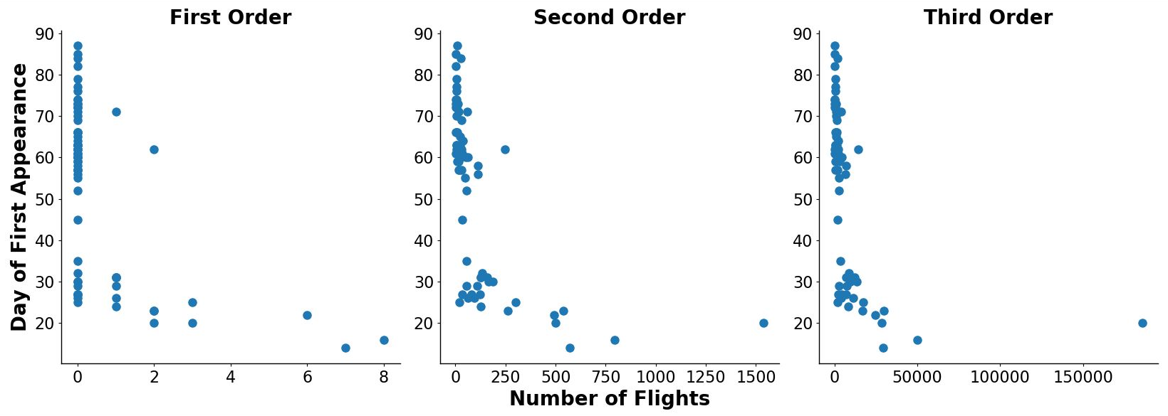
As the charts above demonstrate, the data follows a similar pattern for each order. More connected countries saw the virus appear earlier than countries with less connection to Wuhan. Rather than following a linear pattern, the relationship appears to be more exponential. Applying a logarithmic transformation reveals that even in those lower traffic area, there’s a correlation between the number of flights and how early the virus appeared:
Viewed this way, the data looks like it’s built out of two different distributions: one for places where the virus emerged within 40 days and one for places where the virus took longer to appear. When transformed like this, the data actually fits a simple linear regression model pretty well:
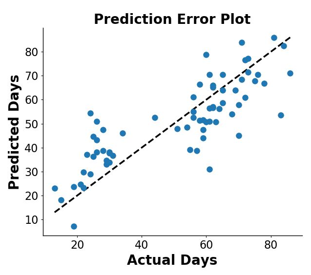
The model is definitely not perfect. The mean square error was 142, but it shows that this method has the potential to predict the spread of a future outbreak via air travel. There are also some interesting results from the model, a few of which are highlighted below:
|
Country
|
Day First Detected – Actual
|
Day First Detected – Expected
|
Error
|
|---|---|---|---|
| Thailand | January 13th | January 23rd | +10 days |
| Japan | January 15th | January 18th | +3 days |
| United States | January 19th | January 7th | -15 days |
| South Korea | January 19th | January 24th | +5 days |
| Vietnam | January 22nd | January 23rd | +1 day |
| Australia | January 25th | February 13th | +19 days |
| India | January 29th | February 1st | +3 days |
| Italy | January 30th | February 7th | +8 days |
The virus appeared in the United States 12 days after the model predicted it would have (coronavirus appeared January 19th and the model predicted January 7th). The model was fairly accurate for many of China’s neighbors, predicting within 5 days for Japan, South Korea, and Vietnam, but it failed to predict that COVID would appear so soon in Thailand, estimating that it wouldn’t reach the country until January 23rd. Overall, though, results are very solid for a first pass.
More Data, More Predictions
It is clear that there is correlation between how connected a country is to Wuhan and when the virus appeared in that country. This shows that pre-existing data has a lot of information that can help communities and health officials prepare for these outbreaks and track what locations might potentially be at risk.
In the future, we would like to take this research even further. Integrating different types of flight information, such as the number of passengers on flights and their final destinations, could make the traffic metric more accurate. New data sources such as geographic proximity to Wuhan and other metrics of connectivity could provide additional context lacking from this iteration. Applying more advanced models to the data could also improve results.