Using Orion to view graphs with thousands of nodes
It’s a cliché that a picture is worth a thousand words, but what if you want to create a picture of two thousand nodes connected to each other with several fields of information attached to each node? Trying to fit it all into a single image can result in what specialists call a “hairball.” Many free tools are available to turn a few dozen pieces of information into a colorful picture, but packing in much more information without creating a mess—an increasingly common need as more data becomes available to more organizations—requires a flexible graph viewer that lets end users easily navigate around in all that data so that they can visually identify the subsets and patterns that help them make decisions.
GA-CCRi’s Stealth can display millions of animated points on a map, along with histograms and other associated data about those geographical points, but several projects needed a way to visually browse data stored in large graphs of nodes and arcs that were unrelated to geospatial information. And, we wanted it to work in a browser so that the machines displaying the graphs required no special software installation.
A graph viewer project that began as a Kibana plugin evolved into a standalone graph viewer called Orion that we built with JavaScript, HTML, and CSS. Orion’s intuitive interface lets end users navigate a graph image by clicking, dragging, and using form fields to zoom, reposition, color code, search, and filter the current graph view. Orion also makes it easy for the developers who provide this data; when their tools assemble the HTML and JavaScript that they’re sending to a browser, they just add a JSON version of the data that they’re graphing along with some variable settings to configure the image’s appearance.
The screenshot below shows a graph of relationships in the Bluth family from TV’s “Arrested Development.” (As one example of how easy it is for developers to configure the graph appearance, when I first created this screenshot, the node label text was too small, but it was simple for me to find the “font-size” attribute in the source JavaScript and change its value from 9px to 12px.) With the cursor hovering on the Tobias node, we see the additional information assigned to it.
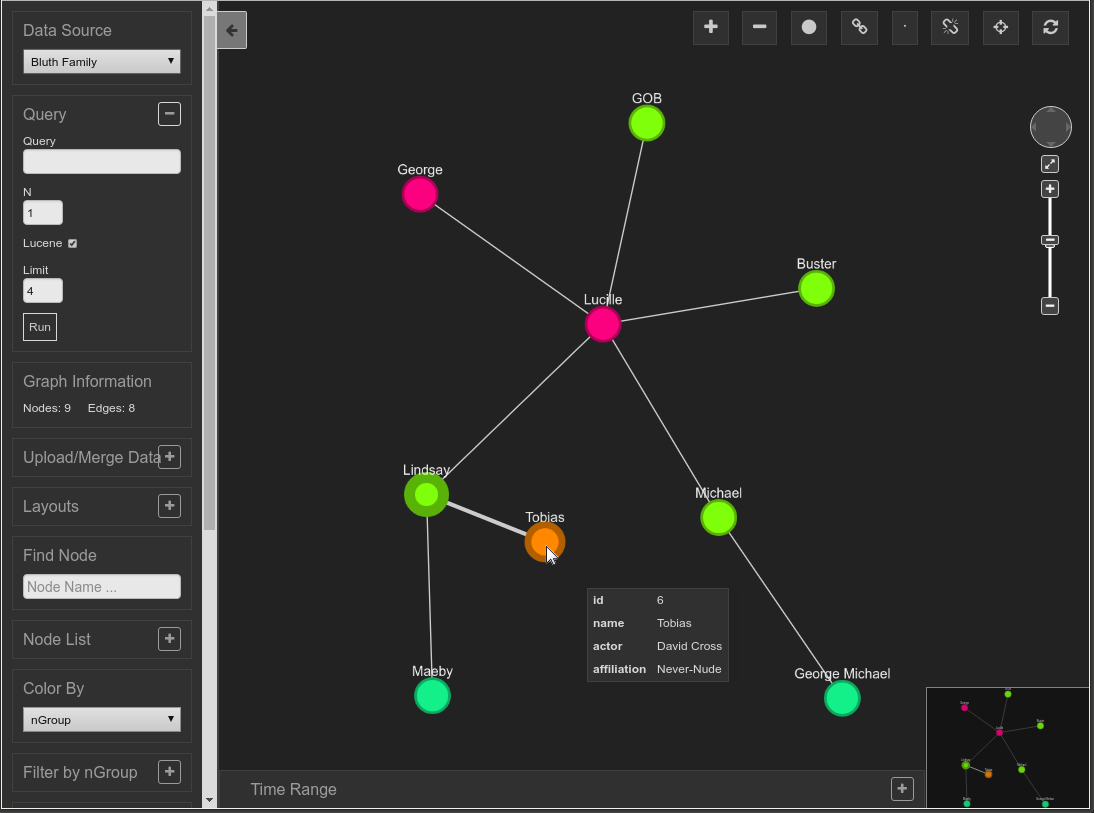
For this example, the nodes are assigned to groups corresponding to each character’s generation in the Bluth family so that Lucille and George are red, their children are yellow-green, their grandchildren are blue green, and their son-in-law is orange. You can reset the colors assigned to the groups using the panel on the left, and the color assigned to each node can be keyed to other data fields besides group.
As the scroll bar on that panel shows, there are so many options for navigating, querying, and adjusting the graph image that they don’t all fit into the panel here. Some highlights:
- The Query field passes along a query to a back end data store such as a SPARQL query to an RDF triplestore or a Cypher query to a Neo4j database.
- The configurable Layouts list offers a choice of different layouts such as a tree, a grid, concentric circles, and others driven by specific algorithms.
- Find Node lets you search for nodes with a particular piece of data associated with them–for example, entering “Cross” here will find the Tobias node.
- Filter by nGroup lets you toggle the display of certain groups. For example, you could hide the display of the Lucille and George nodes because they are in the same group.
- Collapse nGroup toggles a group of nodes into a single large node that has all the connections to other nodes that the individual ones had.
- Filter Nodes toggles the display of nodes with a certain piece of data associated with them. For example, doing so in the graph above with the string “George” will restrict the display to just the “George” and “George Michael” nodes.
- Filter Edges toggles the display of edges based on filter keywords assigned to those edges in the data. For example, if an edge filter keyword called “parent” was used with the edges connecting George and Lucille to their children and the edges connecting Lindsay and Tobias to Maeby and Michael to George Michael, you could turn these off and on all at once.
Other screen controls let you zoom in and back, collapse and expand clusters of nodes, and find the shortest path between two selected nodes.
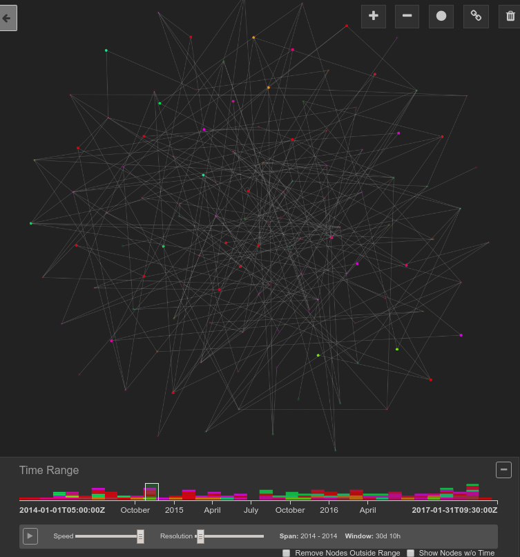
A common theme among these features is that they offer different approaches to easily viewing different subsets of the graph. When you work with a graph that has hundreds or thousands more nodes and edges than the toy graph shown above, the ability to slice and dice your data according to different dimensions provides a toolset that lets you untangle hairballs in order to identify important relationships.
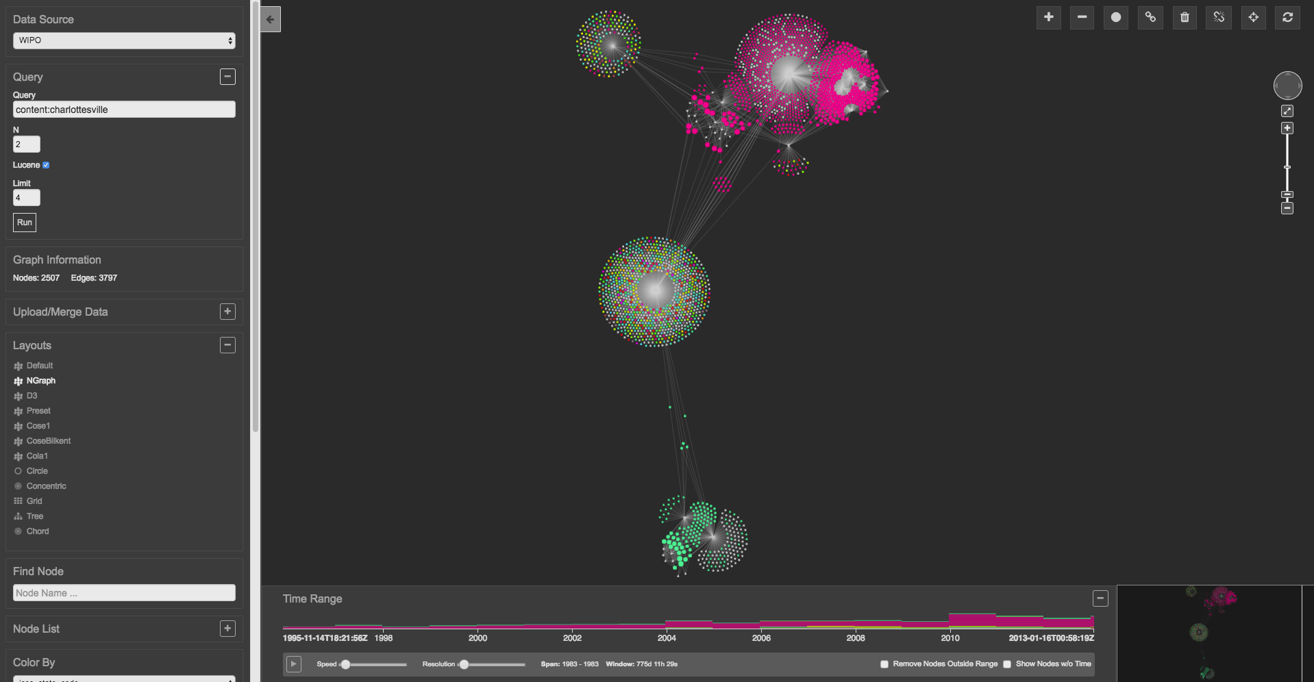
Time is another dimension that Orion lets you explore. The following graph’s nodes each have timestamps, and the color-coded timeline below it shows which groups of nodes appear in which time ranges. Dragging the slider across the timeline with the mouse or clicking the Play button in the lower-left makes the nodes appear and disappear on the display to reflect the start and end of their existence:
Calling Orion a graph viewer is actually a bit of a misnomer, because it also offers the ability to edit graphs. Icons on its screen let you add and remove nodes and edges and edit the data associated with them.
Orion’s capabilities continue to grow. GA-CCRi developers are currently exploring techniques to make it support up to 100,000 nodes using technology such as GPUs. Meanwhile, as other projects around GA-CCRi put Orion to use helping customers get more out of their diverse data sets, they provide use cases to add new features to Orion.
Orion definitely has a colorful future!