Z Earth, it is round?!
In which visualization helps explain how good indexing goes weird.
The flat-Earthers may be on to something.
GeoMesa, like many other data stores that index geographic data, uses space-filling curves to impose an order on two-dimensional geometries. It’s easy to know that “Virginia” as a string data type follows “Illinois” when sorted alphabetically, but it’s much less obvious whether the multi-polygon that is Virginia’s border should come before or after Illinois’ state boundary in an index. The standard solution is to divide the Earth into discrete cells and then use a fixed pattern to define an ordering among those cells. A space-filling curve is a function that, for a given grid-cell resolution, can define a fixed ordering among the cells; imagine a line that visits every cell in the grid, and on which the relative positions of Illinois and Virginia help to build an index that lets a geospatial database manager find locations more quickly.
The advantage of ordering cells is that the columnar data stores GeoMesa supports—Accumulo, HBase, Cassandra, the S3 file system, and Kafka—provide range queries that are easily built from the linear ordering that the curves impose on grid cells. Looking for Charlottesville, Virginia? No worries; that’s in cell #171, right after Venezuela in cell #16 and right before West Africa in cell #18. See the first figure, below, for an illustration of a discretization of the map into grid cells as well as one space-filling curve ordering of those cells.
A commonly used curve in GeoMesa is the Z-order (or Morton) curve. The SFCurve library—also organized within The Eclipse Foundation’s LocationTech working group, and whose principal contributors, like me, work on GeoMesa and GeoTrellis—contains the code for the Z2, or two-dimensional, geo-only version of the Z-order curve. When we visualize the Z2 progression, we typically draw it on a flat, rectangular longitude-latitude map like this:
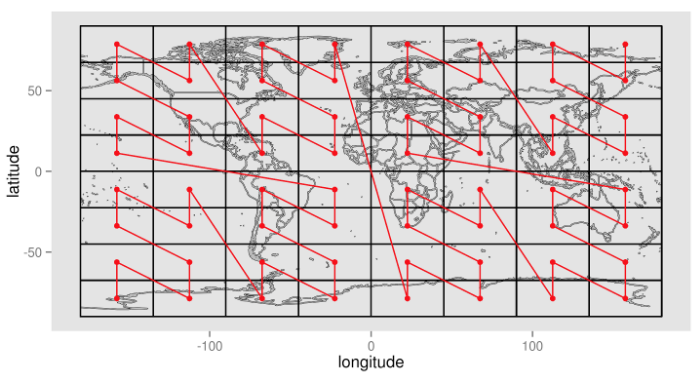
The curve’s progression from the South-West corner to the North-East corner is clean, easy to follow, and orderly.
It’s also a lie.
Being a bear of very little brain, it took me longer than the other SFCurve contributors to realize that it matters that the Earth may not be flat. The peril is not that we might fall off the edge; rather, the risk is that we misrepresent the relationship between the polar regions and the equatorial regions. To get a sense for how different the Z2 looks in practice, we created the following brief animation2. It uses a 9-bit Z2 curve that creates 32 horizontal cells and 16 vertical cells3 that are 11.25° high by 11.25° wide “squares”. To make the math simpler, we are using a perfect sphere.
There are two striking features that leap out of the animation:
- Even though the vertices of the curve remain on the surface of the sphere, the edges do not. In fact, the longer the edge, the deeper (closer to the center) it is embedded in the sphere. The smallest Zs almost look like they’re on the surface, but the largest Z, which defines the halves of the map, almost looks like the polar axis. This is a curiosity.
- The curve over-represents the polar regions significantly. The top-most and bottom-most horizontal rings cover much less area than do the equatorial rings, but still contain the same number of cells. This is a problem.
How much smaller are polar cells than equatorial cells?
Creating a still, rotated rendering helps to illustrate the problem:
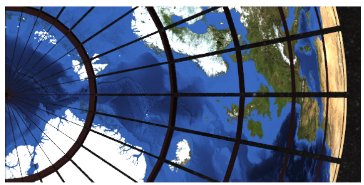
Visually, it is clear that 11.25° squares are no longer meaningful once we’ve used a spherical mapping instead of a flat mapping. This is more than a curiosity, though, because the area of the polar cells is significantly less than the area of the equatorial cells, meaning that a single Z2 index does not carry uniform information: The further the Z2’s cell is from the equator, the more precisely it constrains the member points’ location.
How much? To answer that question, it is helpful to sketch the geometry4:
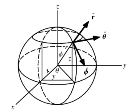
The sketch uses spherical coordinates. The most important labels are these:
- r: the diameter of the spherical Earth, assumed to be 1.0—the unit sphere—because it washes out when we compute the ratio of the area of a polar cell to the area of an equatorial cell; consequently, none of the equations include the radius5.
- theta (ϴ): the longitude, defined on [0, 2π] just as it is on the flat map (when using all non-negative degrees), since the translation from radians to degrees maps π radians to 180 degrees.
- phi (Φ): the latitude, defined on [0, π] just as it is on the flat map.
There are a few additional symbols for the quantities that most interest us:
- Ap: the area of a cell in the ring nearest the pole
- Ae: the area of a cell in the ring nearest the equator
The equations for the these two variables, solved by Wolfram Alpha6, are:
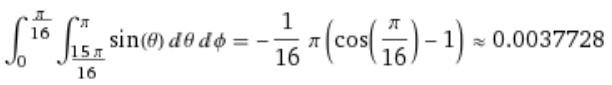
Equation 1. Ap: area of a 11.25 degrees-square (π/16 radians-square) cell adjacent to the North poleintegrate (integrate sin theta dtheta from 15pi/16 to pi) dphi from 0 to pi/16</a
Equation 2. Ae: area of a 11.25 degrees-square (π/16 radians-square) cell adjacent to the equator integrate (integrate sin theta dtheta from pi/2 to 9pi/16) dphi from 0 to pi/16
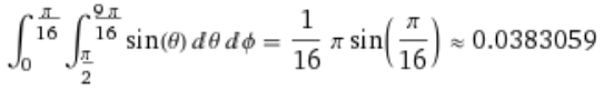
The ratio of these cell areas gives us:
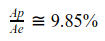
For geospatial indexing, cell size matters. If I lose my wallet in the house, I have some hope of finding it without being late for work; if I lose my wallet in the mall, I might as well start canceling my credit cards, because I have no time to conduct an exhaustive search. This is analogous to the problem of using Z2 grid cells on a round earth: near-pole cells are only about one tenth as large as the near-equator cells, which means that they are more precise. If you know that a tweet originated in a near-pole cell, it tells you a lot more about where the Twitter user was, because there’s only a tenth as much wiggle room in that cell compared to the near-equator cell.
Moreover, as we use more bits in the Z2 curve, dΦ gets smaller and smaller, and the rings closest to the pole get even closer. At the same time, the equatorial rings get nearer to the equator, and the ratio of Ap/Ae approaches 0. This is a problem only inasmuch as most of the population (and their attending data that we actually care about) are located far from the poles.
This problem is not specific to the Z2 curve, but applies to all space-filling curves that work on an evenly-gridded version of a flat latitude-longitude surface. Compact Hilbert and Peano curves, for example, share this same pathology. The most effective and obvious workaround is to stop using a flat latitude-longitude surface for drawing uniform grid cells. For example, we could use a space-filling curve that operates on equilateral triangles, and treat the globe like a giant d207 die from Dungeons & Dragons8. A more mundane approach would be to simply change the function that maps latitude values to cells so that the equatorial cells become shorter and the polar cells become taller, reducing the discrepancy in their areas.
For a geospatial index, the core concern isn’t the shape of the grid cells, but what that shape implies about how data can or cannot be stored and queried effectively. The fact that the most precise indexing, and consequently the most efficient retrieval, is allocated to data that are located furthest from the equator is very much a problem for GeoMesa just like it is for all of the other geo-indexing systems that use rectangular lat/long grids.
GeoMesa itself does not define the space-filling curves nor the map from curve indices to grid cells. Those responsibilities belong to the SFCurve library, and so that is where the active research is being done to address these challenges, and that’s the GitHub repository to watch.
Z2 accommodations for a round Earth are just over the horizon. Meanwhile, the next time you see a GeoMesa T-shirt, you’ll have a much better understanding of the math that went into it!
1 Assuming a 6-bit Z-order curve (drawn more like an N-order curve, with an “XYXYXY” bit interleaving) as depicted in the first figure.
2 Thanks to NASA’s Visible Earth for the sphere texture, and their Deep Star Maps for the sky-box background. POV-ray, although it may be old, still does a capable job of rendering the scene.
3 The 9 bits are interleaved as follows: XYXYXYXYX, implying that the large “polar spike” in the image and animation is actually a horizontal jump between the West and East hemispheres.
4 Illustration copied from Weisstein, Eric W. “Spherical Coordinates.” From MathWorld–A Wolfram Web Resource. http://mathworld.wolfram.com/SphericalCoordinates.html
5 If it would make you feel better, squint just a bit and imagine that you see an “r2” term at the head of the integration expressions.
6 Not content to rely on my own memory of spherical integration, I first wrote code to compute this using trapezoidal subdivisions. Happily, the analytic and numerical approaches agreed.
7 For those unfamiliar with D&D, the shape alluded to is a regular icosahedron.
8 This inclines one to remember Einstein’s “God does not play dice.” For a fun discussion about that idea, see http://www.hawking.org.uk/does-god-play-dice.html